公開日時:2022.05.08
最終更新日:2022/05/26
【Web初心者向け】CSSで横並びにする方法
こんにちは!
今日から家での禁酒をはじめた、Global Web Designの福田です(笑)
Web制作のときに要素を横並びにしたい時ありますよね?
今回はそんな方のために、「display: flex」と一緒によく使うCSSをご紹介します!
目次
display: flex
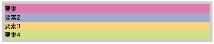
「display: flex」 は要素を横に並べたいときに使います。
<ul>
  <li>要素</li>
  <li>要素2</li>
  <li>要素3</li>
  <li>要素4</li>
</ul>
ul{
margin: 10px;
padding: 10px;
background-color: #aaa;
}
li{
list-style: none;
}
li:first-of-type{
background-color: #DB7BB1;
}
li:nth-of-type(2){
background-color: #A4A9CF;
}
li:nth-of-type(3){
background-color: #F6D580;
}
li:last-of-type{
background-color: #CFE283;
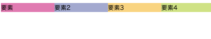
}このようなHTMLがあったとします。liタグは、ブロック要素なので縦に並んでしまいます。
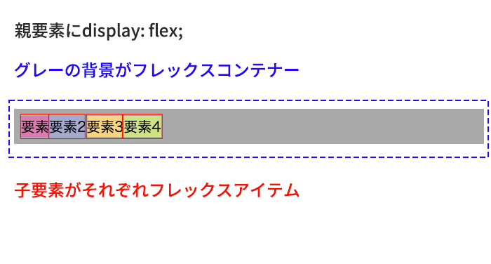
ulタグに「display: flex」をかけて横並びにします。
ul{
  display: flex;/* 追記 */
  margin: 10px;
  padding: 10px;
  background-color: #ccc;
}
li{
  list-style: none;
}
li:first-of-type{
  background-color: #DB7BB1;
}
li:nth-of-type(2){
  background-color: #A4A9CF;
}
li:nth-of-type(3){
  background-color: #F6D580;
}
li:last-of-type{
  background-color: #CFE283;
}
このようにliタグが横並びになりました。
親要素のulタグに「display: flex」をかけると、 かけた親要素をフレックスコンテナ、その子要素のタグがフレックスアイテムとなります。
「display: flex」とあわせてよく使う、「flex-wrap」「justify-content」「align-items」「gap」もご紹介します。
flex-wrap
「flex-wrap」はフレックスコンテナーにフレックスアイテムを1行に押し込むか、複数行に折り返してもいいかを指定します。
先ほどのCSSに「width」を指定してみましょう。
ul{
  display: flex;
  margin: 10px;
  padding: 10px;
  background-color: #ccc;
  width: 650px;/* 追記 */
}
li{
  width: 50%/* 追記 */;
  list-style: none;
}
li:first-of-type{
  background-color: #DB7BB1;
}
li:nth-of-type(2){
  background-color: #A4A9CF;
}
li:nth-of-type(3){
  background-color: #F6D580;
}
li:last-of-type{
  background-color: #CFE283;
}
ulタグに「width: 650px;」、liタグに「width: 50%;」をかけています。本来はliタグは「要素」「要素2」で一列になるはずですが、全部横並びになっています。
「flex-wrap」の初期値は「flex-wrap: nowrap;」で折り返しをせずに一列に並んでいます。
ここでCSSにulタグに「flex-wrap: wrap;」を追記します。
ul{
  width: 100%;
 display: flex;
  flex-wrap: wrap; /* 追記 */
}
li{
  width: 50%;
  list-style: none;
}
li:first-of-type{
  background-color: #DB7BB1;
}
li:nth-of-type(2){
  background-color: #A4A9CF;
}
li:nth-of-type(3){
  background-color: #F6D580;
}
li:last-of-type{
  background-color: #CFE283;
}
ブラウザで見ると
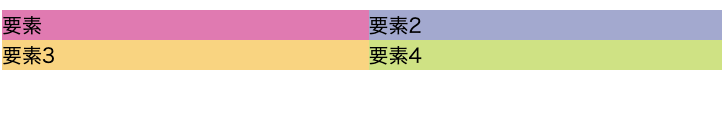
このように折り返しの設定をすることができました。
justify-content
「justify-content」は フレックスアイテムの主軸の方向の位置を指定します。
実際どのようになるか見てみましょう!
HTMLとCSSをこのように書きかえます。
<div>
  <p>flex-start</p>
  <ul class="flex-start">
    <li>要素</li>
    <li>要素2</li>
    <li>要素3</li>
    <li>要素4</li>
  </ul>
</div>
<div>
  <p>center</p>
  <ul class="center">
    <li>要素</li>
    <li>要素2</li>
    <li>要素3</li>
    <li>要素4</li>
  </ul>
</div>
<div>
  <p>flex-end</p>
  <ul class="flex-end">
    <li>要素</li>
    <li>要素2</li>
    <li>要素3</li>
    <li>要素4</li>
  </ul>
</div>
<div>
  <p>space-between</p>
  <ul class="space-between">
    <li>要素</li>
    <li>要素2</li>
    <li>要素3</li>
    <li>要素4</li>
  </ul>
</div>
<div>
  <p>space-around</p>
  <ul class="space-around">
    <li>要素</li>
    <li>要素2</li>
    <li>要素3</li>
    <li>要素4</li>
  </ul>
</div>
ul{
margin: 10px;
padding: 10px 0;
background-color: #aaa;
display: flex;
width: 650px;
}
.flex-start{
justify-content: flex-start;
}
.center{
justify-content: center;
}
.flex-end{
justify-content: flex-end;
}
.space-between{
justify-content: space-between;
}
.space-around{
justify-content: space-around;
}
li{
list-style: none;
}
li:first-of-type{
background-color: #DB7BB1;
}
li:nth-of-type(2){
background-color: #A4A9CF;
}
li:nth-of-type(3){
background-color: #F6D580;
}
li:last-of-type{
background-color: #CFE283;
}
ブラウザで見るとこのようになります。
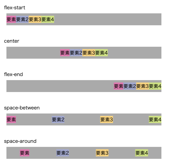
flex-start
「justify-content: flex-start;」はフレックスアイテムを先頭に寄せます。
通常、左端に配置されます。
center
「justify-content: center;」フレックスアイテムを中央に寄せます。
通常、左右中央に配置されます。
flex-end
「justify-content: flex-end;」フレックスアイテムを末尾に寄せます。
通常、右端に配置されます。
space-between
「justify-content: space-between;」はフレックスコンテナの中でフレックスアイテムを均等に配置します。
最初のフレックスアイテムは左端に、最後のフレックスアイテムは右端に寄せられます。
space-around
「justify-content: space-around;」はフレックスコンテナの中でフレックスアイテムを均等に配置します。
「space-between」と違う点は、最初のフレックスアイテムの前と最後のフレックスアイテムの後ろに余白がつきます。
最初と最後の余白は、 隣接するアイテム同士の間隔の半分の幅になります。
align-items
「align-items」はフレックスコンテナ内のフレックスアイテムの方向の縦方向の位置を指定するときに使用します。
実際に見ていきましょう!
HTMLとCSSを書き直します。
<div>
  <p>flex-start</p>
  <ul class="flex-start">
    <li>要素</li>
    <li>要素2</li>
    <li>要素3</li>
    <li>要素4</li>
  </ul>
</div>
<div>
  <p>center</p>
  <ul class="center">
    <li>要素</li>
    <li>要素2</li>
    <li>要素3</li>
    <li>要素4</li>
  </ul>
</div>
<div>
  <p>flex-end</p>
  <ul class="flex-end">
    <li>要素</li>
    <li>要素2</li>
    <li>要素3</li>
    <li>要素4</li>
  </ul>
</div>
<div>
  <p>baseline</p>
  <ul class="baseline">
    <li>要素</li>
    <li>要素2</li>
    <li>要素3</li>
    <li>要素4</li>
  </ul>
</div>
ul{
margin: 10px;
padding: 10px 0;
background-color: #bfbfbd;
display: flex;
width: 650px;
}
.flex-start{
align-items: flex-start;
}
.center{
align-items: center;
}
.flex-end{
align-items: flex-end;
}
.baseline{
align-items: baseline;
}
li{
list-style: none;
width: 100px;
}
li:first-of-type{
background-color: #DB7BB1;
height: 40px;
}
li:nth-of-type(2){
background-color: #A4A9CF;
height: 60px;
}
li:nth-of-type(3){
background-color: #F6D580;
height: 80px;
}
li:last-of-type{
background-color: #CFE283;
height: 100px;
padding: 20px 0;
}今回は縦方向の位置がわかりやすいように、子要素に「height」を指定しました。
ブラウザで見るとこのようになります。
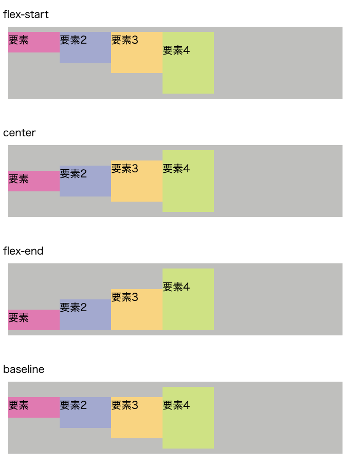
flex-start
「align-items: flex-start;」はフレックスコンテナの縦軸の上部に配置されます。
center
「align-items: center;」はフレックスコンテナの縦軸の中央に配置されます。
flex-end
「align-items: flex-end;」はフレックスコンテナの縦軸の下部に配置されます。
baseline
「align-items: baseline;」 はフレックスアイテムの ベースラインに合わせて配置されます。
gap
「gap」とは溝と言う意味で、フレックスアイテムの余白をあけることができます。
実際に見ていきましょう!
このようなHTML、CSSを書きます。
<ul>
  <li>要素</li>
  <li>要素2</li>
  <li>要素3</li>
  <li>要素4</li>
</ul>
ul{
margin: 10px;
padding: 10px 0;
background-color: #bfbfbd;
display: flex;
flex-wrap: wrap;
width: 650px;
}
li{
list-style: none;
width: 300px;
}
li:first-of-type{
background-color: #DB7BB1;
}
li:nth-of-type(2){
background-color: #A4A9CF;
}
li:nth-of-type(3){
background-color: #F6D580;
}
li:last-of-type{
background-color: #CFE283;
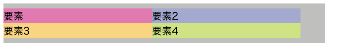
}子要素に「flex-wrap: wrap;」をかけて折り返しをさせている状態です。
ブラウザで見ると
ここに「gap」をかけて余白をあけていきましょう。
「gap」の書き方はこのように書きます。
gap: 横の溝 縦の溝;「gap」は横の溝と縦の溝を指定できます。
CSSに「gap」を追記します。
ul{
  margin: 10px;
  padding: 10px 0;
  background-color: #bfbfbd;
  display: flex;
  flex-wrap: wrap;
  width: 650px;
  gap: 20px 40px; /* 追記 */
}
li{
  list-style: none;
  width: 300px;
}
li:first-of-type{
  background-color: #DB7BB1;
}
li:nth-of-type(2){
  background-color: #A4A9CF;
}
li:nth-of-type(3){
  background-color: #F6D580;
}
li:last-of-type{
  background-color: #CFE283;
}
ブラウザで見るとこのような状態になります。
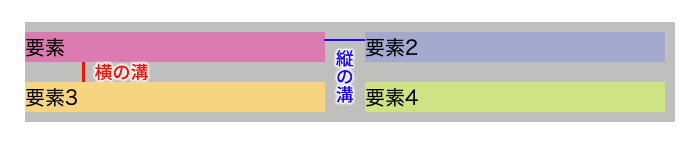
横の溝に20ピクセル、縦の溝に40ピクセルの余白をつけることができました。
まとめ
いかがでしたでしょうか?
今回は「display: flex」と一緒によく使うCSSをご紹介しました!
要素を横並びにするときによく「display: flex」は使います!
あわせて「flex-wrap」「justify-content」「align-items」「gap」なども使うとコーディングの幅が広がります!
是非、覚えてコーディングを効率よく書いていきましょう!