公開日時:2022.06.18
最終更新日:2022/06/18
モーダルウインドウを実装しよう!

こんにちは!
昼ごろ腹痛でダウンしていたGlobal Web Designの福田です
Webサイトによく使われるモーダルウインドウですが、実装にはCSSとJavaScriptを使う必要があります。
そこで今回は
「モーダルウインドウって何?」
「モーダルウインドウはどうやって実装するの?」
と疑問をお持ちの方に向けてモーダルウインドウをご紹介していきます!
目次
モーダルウインドウとは
モーダルウインドウとはボタンを押すとウインドウが暗くなって、新たなウインドウ画面が表示される機能になります。
このようなウインドウですね。
みなさんもいろいろなWebサイトで使われているのを見たことがあるかと思います。
モーダルウインドウはその画面で操作を終えないと画面を遷移することができません。
会員登録画面や、年齢制限の画面などにもモーダルウインドウが使われていることが多いです。
モーダルウインドウはその操作を完了するか、操作をキャンセルするまで他の操作をできなくする「操作の制御」の役割があります。
モーダルウインドウの実装
ここからはモーダルウインドウの実装について解説したいと思います。
モーダルウインドウを実装する手順は
- モーダルウインドウを開くボタンを作る
- モーダルウインドウをHTML、CSSで作る
- JavaScriptでモーダルウインドウの表示と、閉じる動作を実装する
という手順になります。
実際にモーダルウインドウを実装していきましょう!
モーダルウインドウを開くボタンを作る
まず最初にモーダルウインドウを開くボタンを実装していきます。
今回はbuttonタグを使っていきます。
<button id="modalOpen">モーダルを開く</button>button{
width: 300px;
height: 50px;
line-height: 50px;
background-color: #2675BC;
color: #fff;
border: transparent;
transition: .5s;
cursor: pointer;
}
button:hover{
opacity: .5;
}このようにHTMLとCSSを書きます。
ブラウザで見るとこのようになります。
buttonタグはマウスを上にのせてもカーソルが変化しないため、CSSに「cursor: pointer;」でマウスが乗ったときに、カーソルを指差す手の画像に変更しています。
「transition: .5s;」は要素の変化をアニメーションさせています。
擬似クラスの「:hover」と一緒に使われます。
button:hover{
opacity: .5;
}でマウスオーバーしたときに、透明度を50%にしています。
その透明度を50%にするまでの時間を「transition: .5s;」でアニメーションさせています。
「.5s」と書いているので0.5秒かけて透明度を50%にしています。
モーダルウインドウをHTML、CSSで作る
モーダルを開くボタンを実装したので、次にモーダルウインドウを実装していきます。
HTMLとCSSにモーダルウインドウを追加します。
<button id="modalOpen">モーダルを開く</button>
<!-- 追記 -->
<div class="modal-bg">
<div class="modal">
<div class="modal-content">
<p>モーダルの内容</p>
<a class="modalClose close">モーダルを閉じる</a>
<div class="close-btn close">
<div>
<span></span>
<span></span>
</div>
</div>
</div>
</div>
</div>button{
width: 300px;
height: 50px;
line-height: 50px;
background-color: #2675BC;
color: #fff;
border: transparent;
transition: .5s;
cursor: pointer;
}
button:hover{
opacity: .5;
}
/* 追記 */
.modal-bg{
position: fixed;
width: 100%;
height: 100%;
background-color: rgba(0, 0, 0, .6);
top: 0;
left: 0;
z-index: 10;
}
.modal{
position: absolute;
top: 50%;
left: 50%;
transform: translate(-50%, -50%);
}
.modal-content{
width: 400px;
height: 200px;
background-color: #fff;
position: relative;
padding: 40px;
box-sizing: border-box;
}
.modal-content>p{
text-align: center;
margin-bottom: 20px;
}
.modalClose{
display: block;
text-align: center;
color: #2675BC;
transition: .5s;
}
.modalClose:hover{
opacity: .5;
}
.close-btn{
position: absolute;
right: 0;
top: -50px;
cursor: pointer;
}
.close-btn>div{
width: 30px;
height: 30px;
position: relative;
}
.close-btn>div>span{
width: 100%;
height: 1px;
background-color: #fff;
position: absolute;
top: 50%;
transform: translateY(-50%);
}
.close-btn>div>span:first-of-type{
transform: rotate(45deg);
}
.close-btn>div>span:last-of-type{
transform: rotate(-45deg);
}ブラウザで見るとこのようになります。
まずモーダルウインドウの背景の色ですがCSSでは
.modal-bg{
position: fixed;
width: 100%;
height: 100%;
background-color: rgba(0, 0, 0, .6);
top: 0;
left: 0;
z-index: 10;
}のようになります。
「position: fixed;」と「top: 0;」「left: 0;」で要素を固定しています。
「width: 100%;」「height: 100%;」で画面幅いっぱいしており、背景色を「background-color: rgba(0, 0, 0, .6);」にしています。
z軸は奥行きで、「z-index: 10;」でz軸を手前にしています。
モーダルウインドウのコンテンツが入る部分は
.modal{
position: absolute;
top: 50%;
left: 50%;
transform: translate(-50%, -50%);
}
.modal-content{
width: 400px;
height: 200px;
background-color: #fff;
position: relative;
padding: 40px;
box-sizing: border-box;
}
.modal-content>p{
text-align: center;
margin-bottom: 20px;
}のようになります。
「.modal」の中のCSSはモーダルが中央にくるようにしています。
「.modal-content」の中のCSSでモーダルウインドウの白い部分を書いています。
最後に「×」の部分のCSSは
.close-btn{
position: absolute;
right: 0;
top: -50px;
cursor: pointer;
}
.close-btn>div{
width: 30px;
height: 30px;
position: relative;
}
.close-btn>div>span{
width: 100%;
height: 1px;
background-color: #fff;
position: absolute;
top: 50%;
transform: translateY(-50%);
}
.close-btn>div>span:first-of-type{
transform: rotate(45deg);
}
.close-btn>div>span:last-of-type{
transform: rotate(-45deg);
}になります。
ハンバーガーメニューと同じ要領で「×」にしています。
最後にモーダルウインドウ「display: none;」で見えないようにします。
button{
  width: 300px;
  height: 50px;
  line-height: 50px;
  background-color: #2675BC;
  color: #fff;
  border: transparent;
  transition: .5s;
  cursor: pointer;
}
button:hover{
  opacity: .5;
}
.modal-bg{
position: fixed;
width: 100%;
height: 100%;
background-color: rgba(0, 0, 0, .6);
top: 0;
left: 0;
z-index: 10;
/* 追記 */
display: none;
}
.modal{
  position: absolute;
  top: 50%;
  left: 50%;
  transform: translate(-50%, -50%);
}
.modal-content{
  width: 400px;
  height: 200px;
  background-color: #fff;
  position: relative;
  padding: 40px;
  box-sizing: border-box;
}
.modal-content>p{
  text-align: center;
  margin-bottom: 20px;
}
.modalClose{
display: block;
text-align: center;
color: #2675BC;
transition: .5s;
}
.modalClose:hover{
opacity: .5;
}
.close-btn{
  position: absolute;
  right: 0;
  top: -50px;
  cursor: pointer;
}
.close-btn>div{
  width: 30px;
  height: 30px;
  position: relative;
}
.close-btn>div>span{
  width: 100%;
  height: 1px;
  background-color: #fff;
  position: absolute;
  top: 50%;
  transform: translateY(-50%);
}
.close-btn>div>span:first-of-type{
  transform: rotate(45deg);
}
.close-btn>div>span:last-of-type{
  transform: rotate(-45deg);
}これでモーダルウインドウを非表示にできました。
JavaScriptでモーダルウインドウの表示と、閉じる動作を実装する
最後にJavaScriptでモーダルウインドウの表示と、閉じる動作を実装します。
具体的には
- buttonをクリックすると「.modal-bg」に「active」クラスを追加
- 「close」クラスをクリックすると、「.modal-bg」の「active」クラスを外す
といった流れになります。
CSSを追記します。
.modal-bg{
  position: fixed;
  width: 100%;
  height: 100%;
  background-color: rgba(0, 0, 0, .6);
  top: 0;
  left: 0;
  z-index: 10;
  display: none;
}
.modal{
  position: absolute;
  top: 50%;
  left: 50%;
  transform: translate(-50%, -50%);
}
.modal-content{
  width: 400px;
  height: 200px;
  background-color: #fff;
  position: relative;
  padding: 40px;
  box-sizing: border-box;
}
.modal-content>p{
  text-align: center;
  margin-bottom: 20px;
}
.modalClose{
  display: block;
  text-align: center;
  color: #2675BC;
  transition: .5s;
}
.modalClose:hover{
  opacity: .5;
}
.close-btn{
  position: absolute;
  right: 0;
  top: -50px;
  cursor: pointer;
}
.close-btn>div{
  width: 30px;
  height: 30px;
  position: relative;
}
.close-btn>div>span{
  width: 100%;
  height: 1px;
  background-color: #fff;
  position: absolute;
  top: 50%;
  transform: translateY(-50%);
}
.close-btn>div>span:first-of-type{
  transform: rotate(45deg);
}
.close-btn>div>span:last-of-type{
  transform: rotate(-45deg);
}
 /* 追記 */
.modal-bg.active{
  display: block;
}
.modal-bg.active{
display: block;
}「.modal-bg」に「.active」が付いたときに表示されるように「display: block;」にしています。
次にJavaScriptでクリックした時の「.active」クラスの追加と削除を実装します。
//モーダルオープン
//.modal-bgをvar modalでmodalに格納
var modal = document.querySelector('.modal-bg');

//#modalOpenをクリックしたとき
document.querySelector('#modalOpen').addEventListener('click',function(){

    //.modal-bgにactiveクラスを追加
    modal.classList.add("active");
  }
);

//モーダルクローズ
//closeクラスがついた要素をcloseBtnに格納
var closeBtn = document.querySelectorAll('.close');

//closeクラスがついた要素をforEachで一致したリストへアクセス
//fuctionの引数にbtnをセット
closeBtn.forEach(function(btn){

  //closeクラスが付いた要素をクリックしたら
  btn.onclick = function (){

    //closeクラスの親要素.modal-bgをmodalに格納
    var modal = btn.closest('.modal-bg');

    //.modal-bgのactiveクラスを外す
    modal.classList.remove("active");
  }
});
JQueryはこちら。
$(function(){
//モーダルオープン
//#modalOpenをクリックした時
$('#modalOpen').click(function(){
//.modal-bgにactiveクラスを追加
$('.modal-bg').addClass('active');
});
//モーダルクローズ
//closeクラスをクリックした時
$('.close').click(function(){
//.modal-bgのactiveクラスを外す
$('.modal-bg').removeClass('active');
})
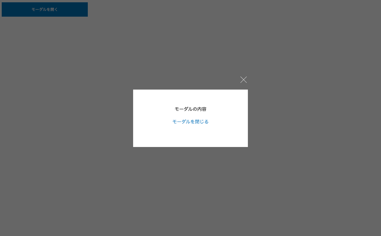
});完成はこちらになります。
See the Pen modal by Fukuda Yuzuru (@fukuda-yuzuru) on CodePen.
まとめ
いかがでしたでしょうか?
今回はモーダルウインドウのご紹介と実装をしました。
モーダルウインドウは複数ある場合「data」などを使ってあげるとまとめて制御できます。
JavaScriptの書き方が少し難しいので、jQueryで初めは実装してみてください!